Well, you all know how I felt about Marsala when it was first announced.
BUT I love a good challenge, and I have always wanted to participate in the Pantone Quilt Challenge hosted by Anne @Play-Crafts and Adrianne @On the Windy Side. I missed out on Radiant Orchid last year ( I had all the fabric and forget why it never got done), so Marsala it was.

I wanted to try and use colors that maybe weren’t the easiest to match to Marsala. I wanted to try and bring out some of the other undertones you find with it, while keeping it warm and friendly. I bought a bundle from Hawthorne Threads, and then added colors to my shopping cart until they looked good on screen. Of course thats always a gamble, the screen won’t show how bright or vibrant a fabric is, but I lucked out and got exactly what I thought I was getting. Woo hoo!!
And then it sat. and sat and sat and sat and sat. AAAAAAAAAND SAT. I had too many ideas to try and time kept on slipping away. I started to panic.
When I finally realized I was overthinking things, I took a step back and started looking through some of my books. I came across the pattern “In the Throne Room” from the book Modern Rainbow by Rebecca Bryant and experienced a true blue AH-HA! moment. I didn’t make it exactly, but you can see the influence in the layout.
Presenting Trade Winds.
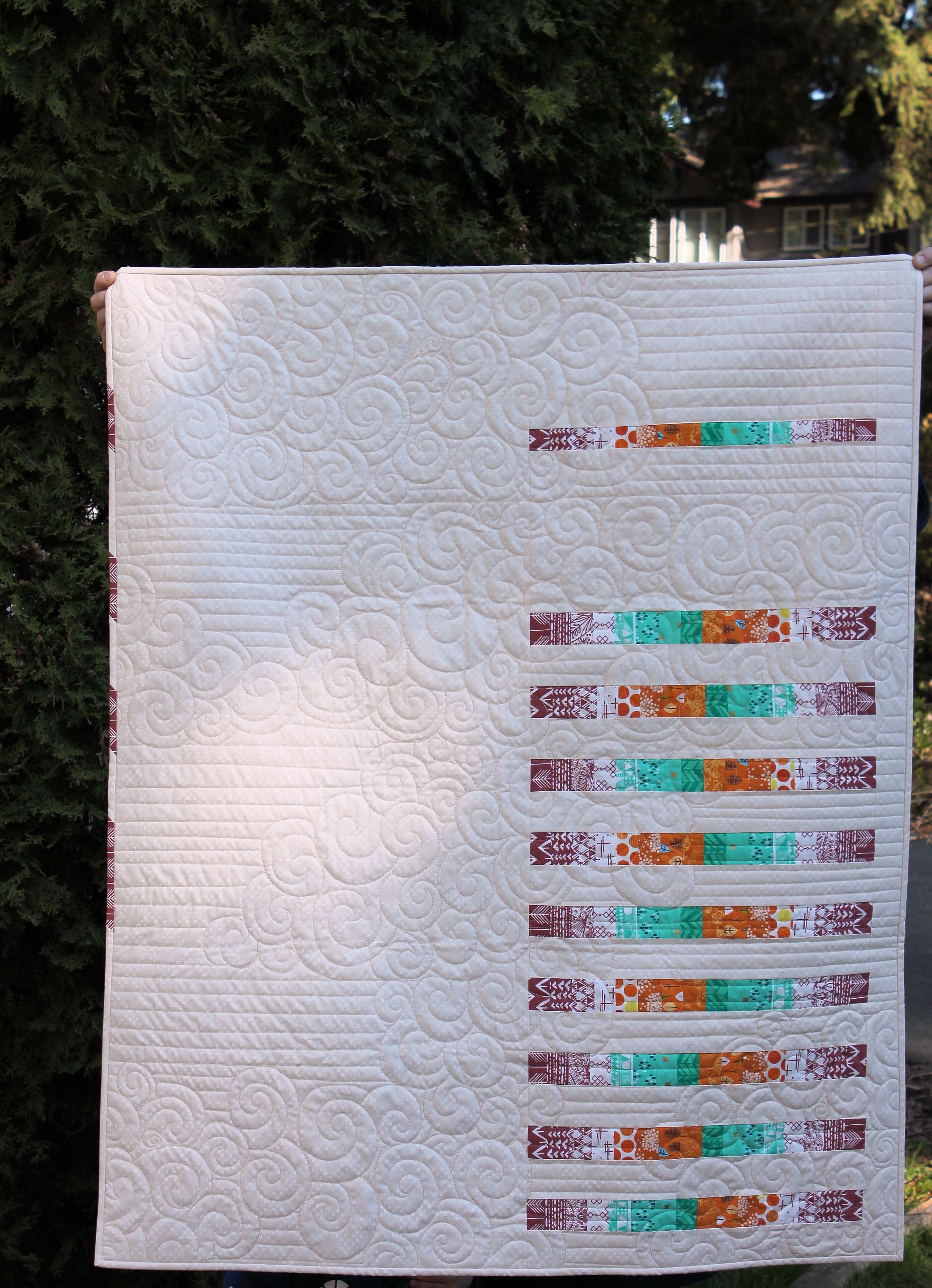
Trade Winds is 42″x55″. For the background I cut into my huge stash of Cotton and Steel Dotties Cousin in Linen. I think it is the perfect neutral and gives a really natural warm glow to the quilt. I picked eight of the Marsala fat quarters based on their value from darkest to lightest and paired them with the jade and tangerine. Those two hues are very very different, but work so well to pull out the earthy tones in the marsala. I also arranged them by value, so the bars fluctuate from dark to light to dark a pair of times across the strip. In the spirit of doing things that are a challenge for me, I left a TON of negative space. I also decided, after laying the strips out, that alternating the direction of the prints really made the quilt interesting, like a back and forth between the two groups of Marsala at either end. 
For the quilting, I took a chance on a variation of a design I saw on 13 Spools. Amy Garro has some great tutorials for quilting, and my favorite is her Matchstick feathers. I am not quite at feather level on the long arm, so I thought I would do some freemotion large swirls, in part to contrast with the pieced bars, and in part to start getting used to the control it takes to really reign the curves in. As I went, I decided to add some horizontal spaced lines to compliment my spaced bars and add the contrast to the swirls. It isn’t matchstick, but the effect is what I wanted,and the result looks like a cloudy sky with the wind blowing between them. The almost Oriental color theme, the back and forth of the colors, and the quilting stuck the name Trade Winds in my head. I think it really suits. I used Aurifil 40wt in Sand for the quilting, and the darker thread did wonders for the quilting!
Of course I Marsala bombed the binding with my favorite arrowhead print, which I also alternated the direction of as a nod to the bars.
This quilt is very different for me, with a lot of super bold elements, and I really love it. I am also happy that I was able to use a unique color pairing to bring out the best in the Marsala. I actually kind of like it!
Linking up with the 2015 Pantone Quilt Challenge.
Happy Stitching,
![]()