Hoffman Challenge 2015- Mariposa

Phew!

The last few months have been a whirlwind! Thank goodness for Instagram, or no one would ever see anything! (I am @staceyinstitches for those of you on IG)

Waaaaaaay back in July, I finished up and sent off my Hoffman Challenge Quilt. for the first time ever, my challenge quilt was finished and mailed more than three days before the deadline. Did you know it’s way less stressful to send things before the deadline? Cuz I do now!

Usually I mail so close to the deadline there is no time for pictures or ground shipping, its a 3-day or bust nail biting marathon of RUSH.

So this year was an immense pleasure. And, I also LOVE the quilt!

IMG_4568

My quilt, Mariposa, is a super enlarged version of the Lillyella Stitchery “Take Wing” pattern. The original finishes at 18″x 24″, a perfect mini quilt size. My version finished at 35″x50″!

One of the biggest factors in finishing early was being able to quilt this on the longarm myself, and some excellent color and design advice/support from my friends. I agonize over color choices sometimes, and this was a doozy. There are over 32 different prints!

2015 fabric texture

2015 Challenge Fabric

I knew I wanted to play up the base colors of the Challenge Fabric. I was drawn to the bright fuchsia pink the most. Then I wanted to contrast and play with the prints until I had an ombre effect, with the body the darkest and the wings the lightest. I pulled about 55 fabrics and had to start paring down from there.

selection

The first pull

11195266_10155519947350367_1670985350_n

Finale, finally!

This was the last of about 15 different photos. Amy, Anne, Gillian and Kim (My QDAD peeps) were hugely patient and helpful in narrowing it down to this.

And then I started sewing. First the body, because it was small and easy for me to work my way into. I fussy cut the different textured indigo areas of the challenge fabric to create  different sections of the body, and threw in some of the prints. I used and indog Hoffman 1895 batik to make the textured pieces stand out.

body

Next came the wings. I started with the bottom wings because there were less pieces,and the color gradient for that was a bit easier. i incorporated some more of the indigo into the wings to balance out the center.

IMG_20150506_163624_hdr_edit

And then the big part, the top wings. It took me a week to make each wing, because the pattern pieces were huge, and each section was very large. I don’t normally use pins when paper piecing, but I had to with these pieces. It helped keep the large pieces of fabric steady.There are a lot of bias edges, and some of the pieces were as long as 22″. I could only piece one or two sections at a time before it got too ungainly and I moved on to other things.

But finally, FINALLY! I finished the top wing sections.  And. I. hated. it.

The fabric that I had pulled for the central wing focus, section 1 of 24, did not work at all. It was a print I LOVE for things ( my Rubix quilt, which I will talk more about in a few days, uses it for the background and it’s amazing)

For a split second I panicked. And then I remembered a technique taught to me at Quiltcon by Cristy Fincher, paperless paper piecing! Part of this technique involves glue baste and piecing from the outside in. So in that vein, section 1 would be the last section pieced. So with that in mind I removed some paper, firmly grasped my seam ripper, sent up a small prayer, and began some quilt surgery.

quilt surgery

Once the offending fabric was removed, I carefully grafted in the new section. I used the main print from Tula Pink’s Foxfield collection. I have tons of it, and it had both the pink and aqua accents in it. I fussy cut the fabric to show off my favorite parts. It worked perfectly, and I couldn’t be happier! I then took my new sugical skills ot the body, where I replaced the accent fabric with more of the fussy cut challenge fabric.

wing

Then I took the quilt off to the long arm. I froze for a bit, I knew what I wanted in the wig sections, but the background had me stymied. After a quick consultation with the amazingly talented Mandy Liens I outlined the butterfly and then used my favorite background filler from Christina Cameli’s book Step-by-Step Free Motion Quilting. This particular design is called Effervescent. Its super simple,and super effective.

IMG_4574

Following Mandy’s advice, I made curled feathers. I love how they look like feathers, but don’t require all the back and forth outlining of real feathers.

IMG_4573

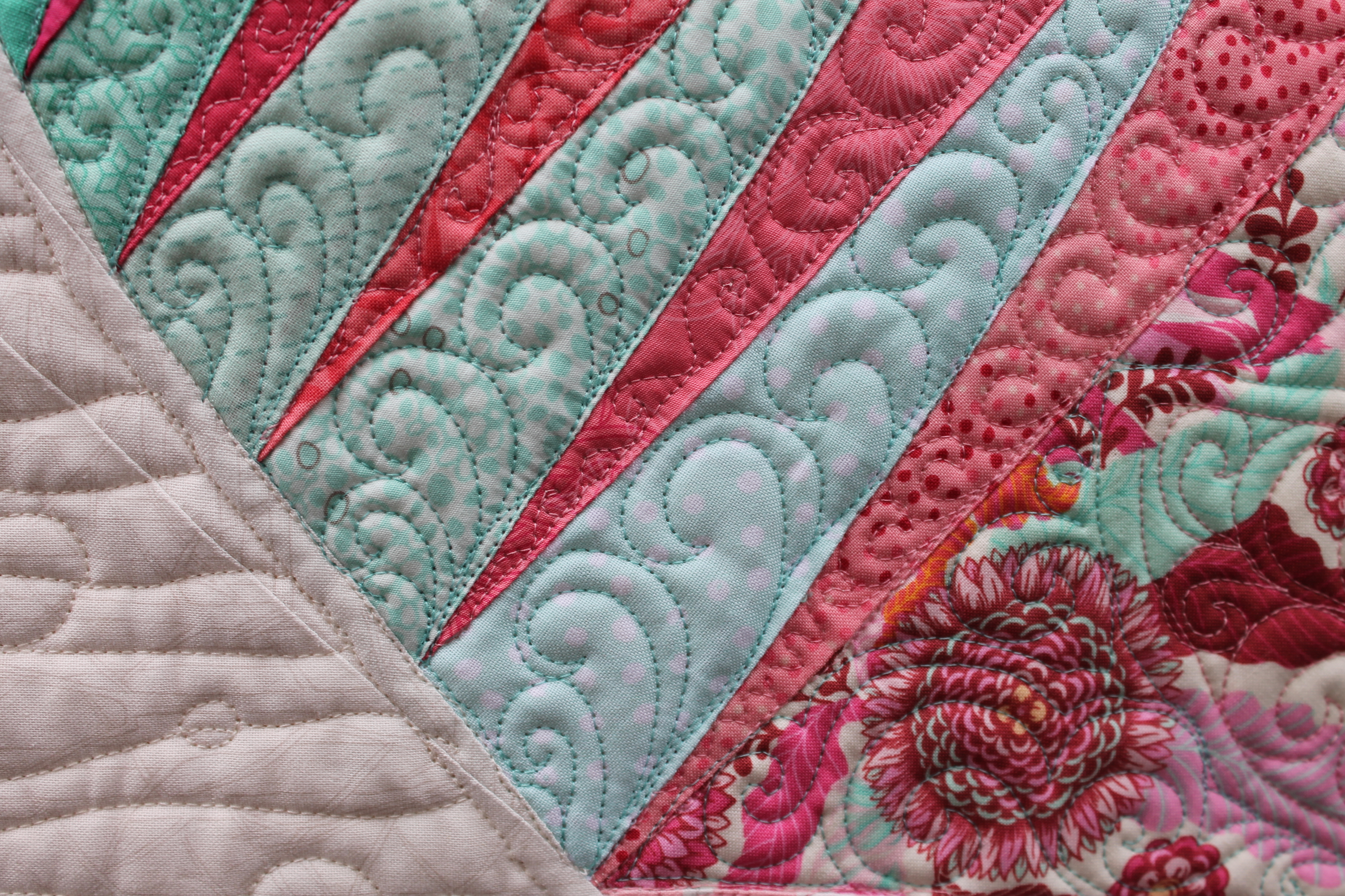
The body I had fun with. I used contrasting thread to create patterns and used mostly straight lines. SUper effective!

IMG_4575

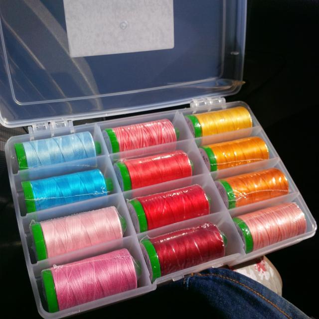
I used a custom box of Aurifil Threads that I picked up at a quilt show on the Sunshine Coast, from Carola’s Quilt Shop booth. I love that you get to build the box yourself from any thread in the shop!

IMG_20150502_161048

Then it was binding, labeling, and off to the front yard for photos. I thought in front of the rose tree would be lovely, but alas, no roses in bloom at the time. (you should see that tree now!)

IMG_4572

I mailed it off and waited. Then in late August the winners list was published, and there was Mariposa in Third place in the Pieced Category! I couldn’t believe it! I got this lovely ribbon (new for the challenge), letter, and two boxes of Aurifil thread as well as the participant packet of fabric and a beautiful enameled pin.

11853984_10155912479220367_1761151762_nprixe

I am so happy with Mariposa. She is winging her way around the USA for the next year as part of the Hoffman Challenge Trunk Show. If you spot her in the wild, snap a picture and sent it to me! or tag me on instagram @staceyinstitches #gianttakewingquilt

Happy Stitching!

StaceyDay_Logo

Letters from Quiltcon

Yesterday emails were sent, read, and either celebrated or commiserated over.

The wait is over, and Quiltcon has its show quilts. Regrettably, none of my quilts will be hanging in Austin this February. Nor am I the only one without an entry, many of my amazing, talented quilting friends did not get in. Instagram has a new hashtag: #quiltconreject

Here is where I have a problem: the word reject.

Reject can be a verb or a noun. As a verb, reject means “dismiss as inadequate, inappropriate, or not to one’s taste” As a noun, reject means “a person or thing dismissed as failing to meet standards or satisfy tastes”. Reject has the undertones of failure, inadequacy, of not being good enough. Its not a very happy word, and using it to describe ourselves and out work is detrimental and frankly insulting.

People, WE ARE NOT REJECTS.

We were not rejected, we were regretfully passed up. Not because our quilts weren’t good enough, but because they just didn’t fit with the vision the curators had for the show.

It is hard to get a letter saying that your work is not chosen. I understand all too well. But that does not mean you aren’t good enough.

Jess over at Quilty Habit spelled it out perfectly in her blog post Positive thoughts on Quiltcon Rejection. She gets to the heart of the matter in a great way. there were over 1300 entries to Quiltcon. The show coordinators have a vision of how they want Modern Quilting to be represented to the public, and the quilts they chose reflect that vision. There are so many interpretations of Modern Quilting, so many aesthetics and techniques and visions, that to narrow it down to one must have been agonizing. But they did, and then they had to flip through the thousand plus entries to find the quilts that reflect the chosen aesthetic. It is the same selection process used in museums and art galleries. You could submit a masterful landscape painting that accurately reflects the people, time, and techniques of the style, but if they want flowers in vases, the landscape isn’t going to make it, no matter how talented and perfect the landscape is.

From what I have seen from the quilts that did get in, this year Modern Quilting will be represented by bright, bold colors, simple quilting, color blocking, and graphic designs.

So lets change the hashtag. Lets rejoice in our shared love of quilting! Lets cheer for our friends in the show! Lets ooh and aah over the quilts that will be displayed, and see the show for what it is : a curated selection of quilts, selected from a pool of the best modern quilts in the world-our quilts!

#notaquiltconreject

*UPDATE* Latifah Saafir at The Quilt Engineer has an amazing, insightful post about the jury process. Go check it out, it helps to put things in perspective!

Happy Goes Mini

Happy Goes Mini

Pantone Color of the Year 2015 is….Marsala?

Yup. Marsala.

PANTONE Colors_Men_10

For a couple weeks now we have been anxiously awaiting the announcement of the Pantone Color of the Year for 2015. Pantone is the leading authority and biggest influence on color in the garment, textile, and design industry. If you want an accurate color, you quote Pantone swatches. Every year Pantone introduces its color of the year, and this year they chose Marsala. MARSALA.

Obviously I have mixed emotions about this color.

My initial reaction was not complimentary. Nor were the words I used to describe it. I won’t repeat it here. 

If I were a garment or interior designer, I would be very happy. There are a lot of possibilities with Marsala in interior design and the fashion world. My wallet, as it turnes out, is Marsala. A crocodile skin print in Marsala, with gold acents and a nice shine. its very nice. I can see a lot of riding boots, belts, purses, wallets, coats, accents on sweaters and home decor such as lamps, rugs, and trim. Even as an accent wall in the home, there are possibilites. The romatic little blurb about the color makes you want to like it and use it, and as makeup, oh goodness, my favorite eyeshadow just happens to be Marsala with a shimmer.

As a quilter and quilt designer however…..it is going to be a challenge to embrace this color.


WIP Wednesday

Stacey is going to Quiltcon!! Woot woot!!

I am super excited to be able to attend Quiltcon 2015. I don’t know how I am going to wait until Feb! Resgistration opened this morning, and man, that was a crazy nightmare of stress, but I got into all the workshops I wanted. It was hard to narrow it down, there are so many great speakers and teachers. I ended up with 3 full days of workshops. I don’t know when I am going to see the show. I might have to try and modify my schedule a bit.  I am doing the Paperless Paper Piecing and Curved Seams Piece-lique taught by Cristy Fincher. For those of you who don’t know, Cristy Fincher is the daughter of the esteemed Sharon Schambers, multi-award winning quilter, and one of my personal quilting inspirations.  Cristy runs the online business Purple Daisies, where you can find Sharon’s lessons and tutorials and patterns. You can also view her award winning quilt up close, Mystique. This quilt is amazing and all my favorite shades of fuchsia. Really, look at her gallery. It’s amazing!


I also got into two of Krista Withers half day quilting workshops. I am especially looking forward to these. I have had the pleasure of hearing her speak at a Vancouver Modern QUilt Guild meeting and seeing her work up close. The two workshops are about composite drawing and and ghost shapes. Exactly what I need!

I still have to go back and see if there are any lectures I might want to go to. Maybe free up some time, we will see what is left. A lot is sold out, but that’s okay, I might learn something new! I am mostly looking forward to meeting my quilting friends in person! So excited!!

On to the WIP portion of the evening!

IMG_20140624_193937

My petal pinwheel quilt top is done and off to Joan for its VIP quilting treatment. Joan seems to be able to read my mind and interpret my psychobabble and give me exactly what I didn’t realize I wanted. So now I am on to my Hoffman Challenge quilt. I went a completely different direction with it this year. Normally I do these paper pieced masterpieces of color and stitchery, but this year I wanted to really bring it in and do something modern. Modern quilts are underrepresented in the Hoffman Challenge (read:none) I wonder if it’s not known enough in the modern quilting world, or it’s the fabric. Either way, its a load of fun and it is a CHALLENGE. You don’t always like the fabric, so creating something you love can be hard, but definitely worthwhile.  I make sure I get the show book each year so I can look at all the lovely quilts that travel the country. The closest mine has ever been was Yakima, WA. Alas, I was unable to make the event but there will be others =)

Pile of pressing...

Pile of pressing…

This evening has been filled with lots of pressing. There is going to be some stitch ripping after this post. A tip for ripping paper piecing stitches- place the blade between the paper and the fabric, the stitches come out cleaner.

IMG_20140624_193932

I have a big mess of precut fabric shapes for such a small quilt ( the max perimeter is 160″, any shape). I also fussy cut the challenge fabric, the background between the print shapes is gorgeous and quite modern. That navy is delish! I also have some triangles cut from a Freespirit Designer Solid in Mulberry. I love that dusty shade of plum purple, and it fits the gray scale perfectly.

IMG_20140624_193955

I thought about including a pair of butterflies in the blocks. What do you think?


I would love to see more modern quilts in the Hoffman show. Maybe I will write to the curator, and I certainly hope you pick up some of the challenge fabric and give it a try! You can find the details here, and the deadline is July 18. Quilts must arrive in Colorado by the end of that day.

Would you consider the Hoffman Challenge with me next year?


Happy Stitching,

Stacey


Linking up to Lee@ Freshly Pieced.

8253389546_fdb631e427_o